Website tips
Why I Rebuilt My Website's Colours (And What It Means for Your Business)
Key takeaways
- Colour signals trust first: Visitors decide if they look credible in seconds, often on a phone in bright daylight, before they read your services or your price.
- Retired the dark "chaos" era: Electric blue glow and full-width dark gradients suited a consultant brand. They did not suit a Birmingham tradesperson trying to decide who to call.
- Birmingham Works: Restrained and local, not grey. Birmingham has Digbeth. This palette is for trades and shop owners, not design festival posters.
- Mostly neutral, one clear action: Calm white and grey surfaces carry the page. One accent colour should point to the main action, usually book or get in touch.
- Contrast beats decoration: Readable text on light backgrounds matters more than a trendy palette. Accessibility is whether people can actually use your site.
- Consistency builds confidence: The same button colour, the same text tone, the same calm base across every page. Inconsistency makes a small business look disorganised.
When someone lands on your website, they are not starting with your About page. They are asking a faster question: does this business look real, local, and easy to contact? Colour is one of the first answers, often before they read a single sentence.
I rebuild websites for trades, shops, and professional services across Birmingham and the UK. While repositioning my own site, I realised the old colour scheme was working against that audience. This article explains what I changed and what you should look for when you evaluate your own site, or brief someone to build one.
What your website colour is actually doing
Colour is not just branding. It sets expectations. A dark, glowing tech palette says enterprise software. Clean white surfaces with restrained accents say straightforward local business. Neither is morally better, but they speak to different customers.
Most of my clients' customers are on their phones. A plumber's customer might be standing in a kitchen with a leak. A solicitor's client might be stressed and scanning three firms in two minutes. In both cases, the site needs to feel calm, legible, and trustworthy. Not like a product launch.
I use a simple test: would a busy tradesperson in Birmingham trust this site enough to tap call? If the design feels like it was built for investors or conference slides, they bounce. Your palette should pass that test before you worry about fonts or animations.
What I had before
The previous version of bengoodman.uk leaned into a "digital chaos" narrative: dark gradient heroes, electric blue glow effects, frosted glass panels. It looked distinctive. It also looked like a SaaS tool or a strategy consultancy, not a web designer who builds sites for local businesses.
Dark full-width backgrounds can work for software products where the interface is the product. For a local services website, they often create three problems. First, they hide the lack of a clear offer. Drama substitutes for "here is what I do and what it costs". Second, they reduce contrast on mobile in bright light. Grey text on dark blue is harder to read on a building site than dark text on white. Third, they signal national agency when my edge is direct access, fixed pricing, and Birmingham roots.
I was not embarrassed by the old look. It matched an earlier positioning. But the business moved: fixed-price websites from £1,995, plain-English copy, trades and shops instead of large ecommerce case studies. The colour scheme needed to move with it.
Before and after
Same site, different signal
The old palette felt like software. The new one is built for local businesses evaluating you on a phone.
Websites from £1,995
What I moved towards
The new direction is lighter, quieter, and deliberately local. I wanted colours tied to place and craft, not another generic ocean-blue SaaS theme. Birmingham is where I am based. The palette draws on workshop whites, civic stone, and weathered metal along canals and older industrial buildings across the West Midlands. That is one side of the city. It is not the whole story.
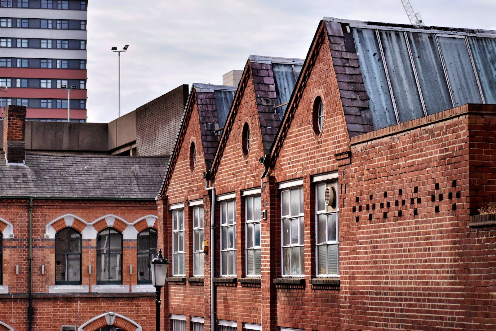
City
Stone, brick, and graphite tones in civic architecture across the city centre.
Photo: Adam Jones
Behind the scenes, everything lives in a design system at design.bengoodman.uk so pages cannot drift into random one-off choices. That discipline matters for client work too. Visitors never see the documentation. They just feel whether the site holds together.
In practice that means white and soft grey surfaces, dark neutral text, and a single steel-blue accent used sparingly. Enough character to feel considered. Not enough colour to compete with the message. I call the full palette Birmingham Works.
How I landed on Birmingham Works
I did not pick colours from a mood board and stop there. I started with the audience. I looked at sites my clients actually trust: local agencies that feel professional without feeling corporate, trades businesses that look tidy on a phone, professional firms that feel established rather than flashy. Then I looked at my own old site and asked where it sat on that spectrum. Too far towards product launch. Not close enough to the businesses I wanted to work with.
From there it was iteration. I tried lighter layouts and stripped back the glow effects. I rejected a few directions that still felt like template ocean blue, the sort of palette every SaaS landing page had five years ago. What kept coming back was restraint: mostly neutral, one confident accent, nothing fighting the copy.
The names came from Birmingham itself. I walk past Victorian stone facades, canal bridges, workshop units, and weathered metal on older industrial buildings. None of that is a literal colour sample, but it gave me a language. Workshop for clean, practical surfaces. City for the stone and aluminium tones you see in civic architecture. Weathered Steel for a blue-grey accent that feels earned rather than decorative.
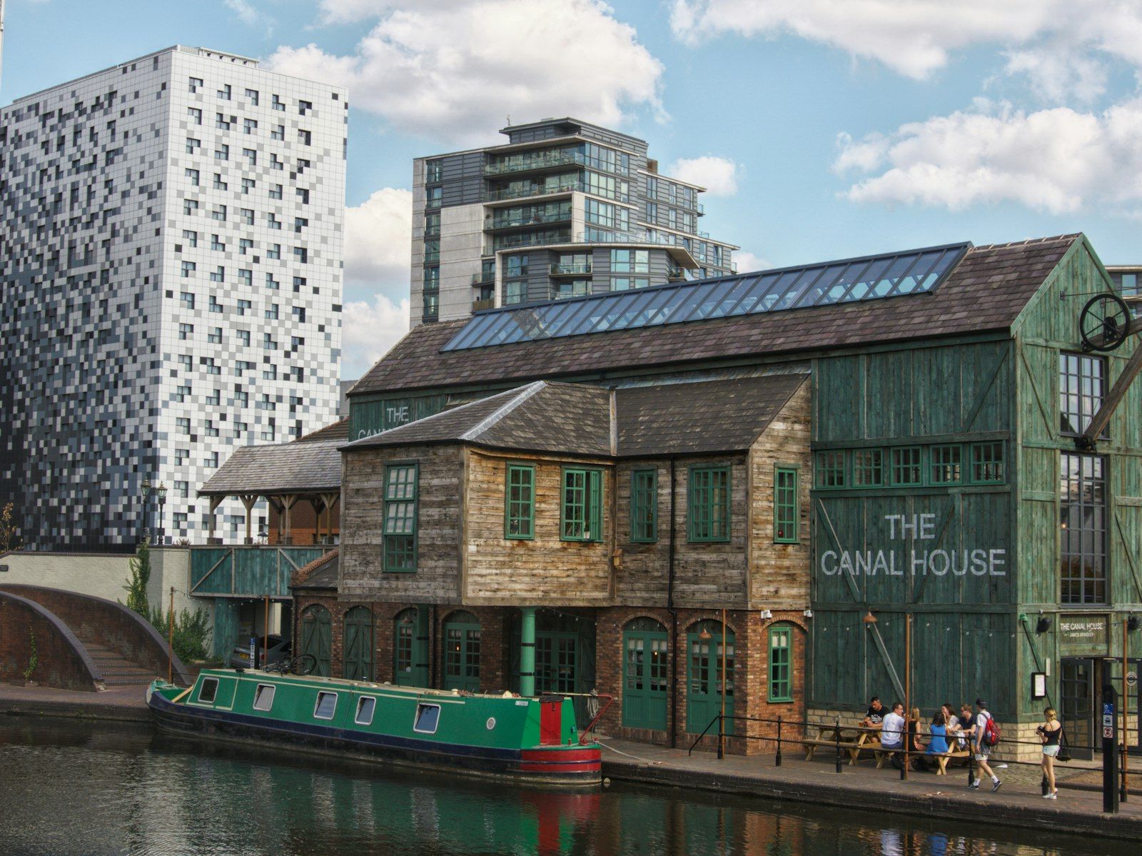
Weathered Steel
Canal-side metal, grey water, and weathered surfaces along the waterfront.
Photo: Eryk Fudala
I am not saying Birmingham is grey. Walk through Digbeth on a weekend and you will see murals, painted warehouses, gig posters, street food, the kind of colour that makes designers reach for their cameras. That energy is real and it belongs here. Digbeth is where Birmingham puts its boldest colour on display.
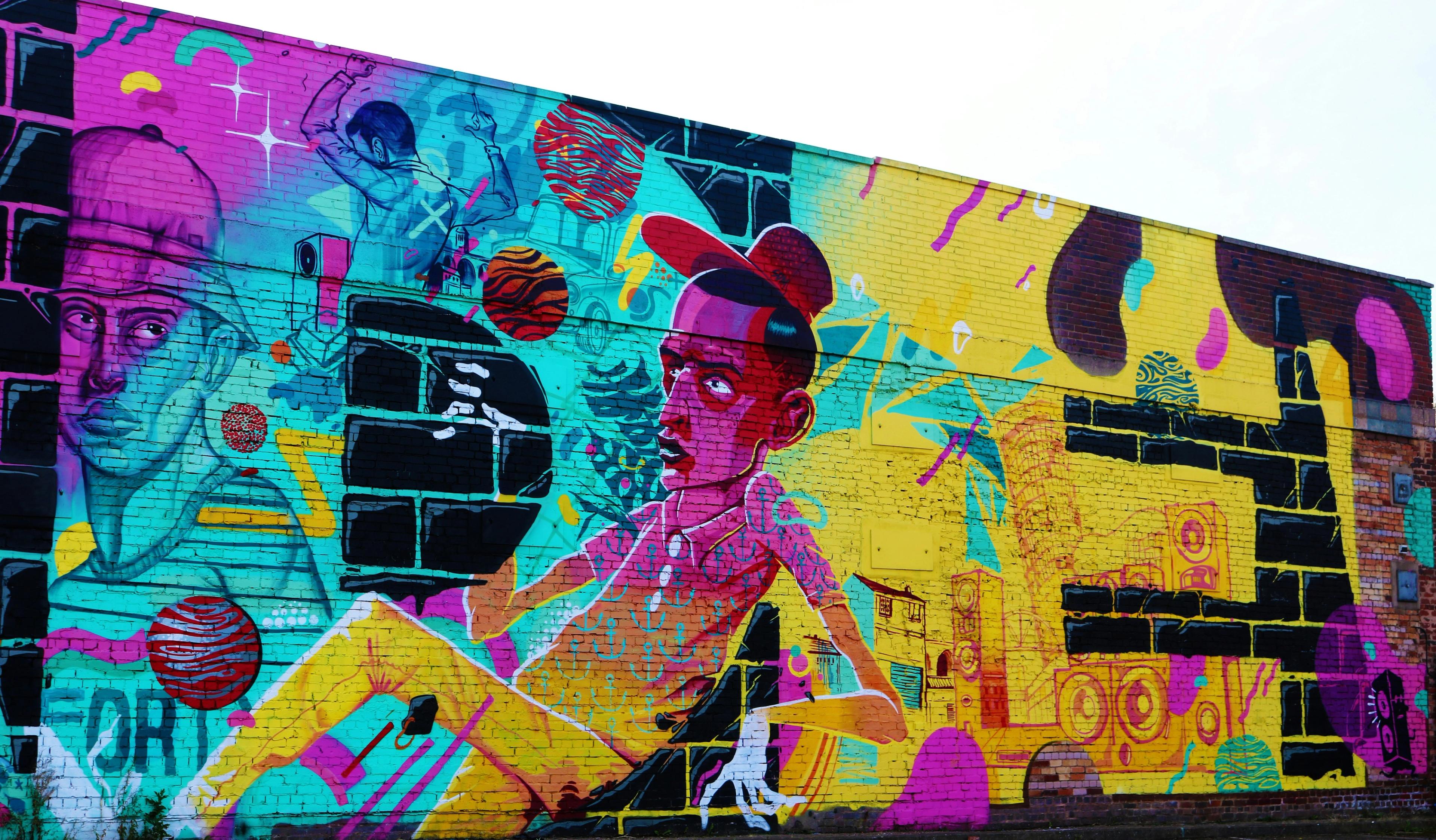
Digbeth
Bold colour belongs here. My client sites are not trying to look like this.
Photo: Timothy Blake
But I am not building a website for an art collective, and I am not designing Birmingham Design Festival to impress other designers. I build sites for plumbers, salons, accountants, and shop owners who need a stranger on a phone to trust them in three seconds. Their customers are not browsing for aesthetic inspiration. They want someone credible, local, and easy to call. Restrained colour serves that job. A Digbeth-grade palette does not.
I tested everything on a phone, outdoors, at arm's length. If I squinted at the homepage and could not find the button, the palette failed. If the text felt faint in daylight, it failed. If it looked like I was selling software instead of websites for local businesses, it failed. The version that survived those tests became Birmingham Works.
What it means for me, and for Birmingham
Personally, the palette is a line in the sand. I spent years positioning as a broader digital consultant. The work I want now is specific: fixed-price websites for trades, shops, and professional services, built by someone you can actually speak to. The colours had to match that honesty. No drama, no borrowed Silicon Valley aesthetic, no pretending to be a twenty-person agency.
I am based in Birmingham and most of my clients are in the West Midlands or wider UK. Birmingham Works is not a marketing slogan plastered across every page. It is a standard I hold myself to. The same care I put into naming and testing these colours is the same care I put into a plumber's service pages or an accountant's contact form. If my own site looks thrown together, why would a local owner trust me with theirs?
For the city, the palette is about belonging to a particular Birmingham audience. Birmingham is a place of makers, workshops, independent shops, and practical professional firms. It is also a place with Digbeth, Custard Factory culture, and no shortage of visual confidence. My clients are mostly in the first camp: businesses that need to look competent on Google, not businesses trying to win a design award.
There is a time and a place for bold colour. Festival season, a brewery taproom, a gallery opening. For a local electrician or a family solicitor, loud colour often works against them. It can make a serious business look like a side project. The visual language I use is workmanlike: clean light, solid type, one clear action. That is how a lot of good local businesses already present themselves on their vans, their shopfronts, and their Google listings. I wanted the site to feel like it came from the same world.
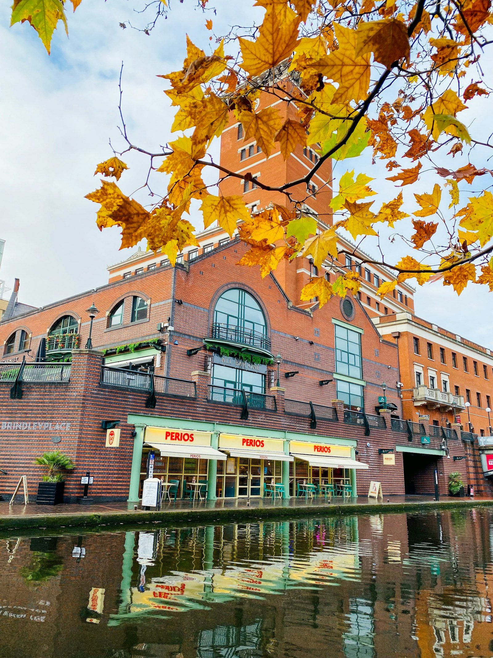
Workshop
Clean light on brick and water. Practical surfaces, not decorative colour.
Photo: farin sadiq
It also draws a boundary. I am not trying to look like a London creative agency or a remote dev shop with no geography. I work with businesses that care about being found locally, looking credible on Google, and turning visits into calls. A palette rooted in Birmingham keeps me honest about who that work is for.
How I use colour on the page
The most important decision was not which blue-grey to pick. It was how much of it to use. Most of the page should be calm surfaces and readable text. The accent colour carries the one action that matters on each screen, usually book a call or get in touch.
- Default backgrounds stay light and open. The site should feel readable, not cramped inside coloured boxes.
- Soft grey bands separate sections without shouting. Borders and cards stay subtle.
- Body copy, headings, and icons share one dark neutral. Three competing dark greys just look messy.
- The accent colour is for primary buttons and little else. Not every icon, not every card, not every section background.
This is the opposite of many template builders, which sprinkle accent colour on icons, badges, timelines, and section backgrounds until everything competes for attention. Restraint is a conversion choice. When only one element per screen is strongly coloured, visitors know where to tap.
Lighter tones handle secondary jobs: small labels above headlines, the odd stat, underlines on links. They add character without breaking the calm base.
Birmingham Works
The palette
Three colour families used across bengoodman.uk. Mostly neutral surfaces, one accent for the main action.
Workshop
Clean, practical surfaces
Workshop White
Page backgrounds
City
Stone, aluminium, and graphite
City Aluminium
Raised section bands
City Stone
Borders and dividers
City Graphite
Headings and body copy
City Graphite Muted
Labels and secondary text
Weathered Steel
Canal-side metal accents
Weathered Steel Dark
Primary buttons
Weathered Steel Ink
Eyebrows and link underlines
Weathered Steel
Stats and soft accents
Contrast, accessibility, and mobile
Accessibility means whether someone can actually use your website: read the text, move through the page with a keyboard, understand which link is which. Colour contrast is a big part of that. Web accessibility guidelines set minimum contrast between text and background. You do not need to memorise the numbers. You do need to know that light grey text on a slightly lighter grey background fails, and that white text on a mid-tone button often fails too.
On my site, primary buttons use light text on a dark enough background to stay readable. Body copy uses dark text on white or near-white. Muted tones are for labels and secondary lines only, never for phone numbers or addresses.
Colour is one layer. Heading structure, form labels, image descriptions, and visible focus on buttons and links matter just as much. A beautiful palette on an unusable form still loses enquiries.
What to look for on your own website
You do not need a bespoke design system to apply these principles. When you review your site, or brief a designer, ask the following.
- Can I read every paragraph easily on my phone in daylight? If not, fix text contrast before you fix anything else.
- Is there one obvious action per screen (call, form, or book) with a single strong button colour? If every element is accented, nothing is.
- Does the site look like the same business as your Google listing and your van signage? Mismatched palettes feel like a scam.
- Are service pages mostly white or neutral with clear headings? Local buyers want clarity, not a mood board.
- Did your template default to bright blues or gradients because that is what sold the theme, not because it suits your trade?
If you are a tradesperson, shop owner, or professional firm, you are not trying to look like a venture-backed app. You are trying to look competent, reachable, and local. Your colours should support that story in under three seconds.
Colour alone will not fix a broken offer
No palette rescues a homepage that does not say what you sell, who it is for, or how to contact you. Colour supports clarity. It does not replace it. The hierarchy I rebuilt alongside the palette was: what I do, who it is for, what it costs, what to do next. Get that right first.
I am publishing broader redesign notes separately for anyone who wants the full picture: layout, performance, SEO, and retiring the old chaos brand. The colour work sits inside that project, but the lessons stand alone. Trust signals, contrast, restraint, and consistency.
I am also running original research, auditing dozens of small business websites across Birmingham and the West Midlands, to see how often these issues show up in the wild. The same patterns repeat. Buried phone numbers, slow mobile loads, and visual noise that makes the business harder to trust, not easier.
What to do next
If you want an honest view of how your site performs for local customers, run the Website Checker or book a free call. I will tell you what to fix first, whether that is colour, clarity, or both.